Zack Michener

I’m a web developer and designer in Seattle, Washington. I support my coffee and vinyl addictions with client work, and keep myself busy with all kinds of other projects. Check out a few below, and reach out if you're looking for help with anything.

Typewriter Cards

card.zjm.me

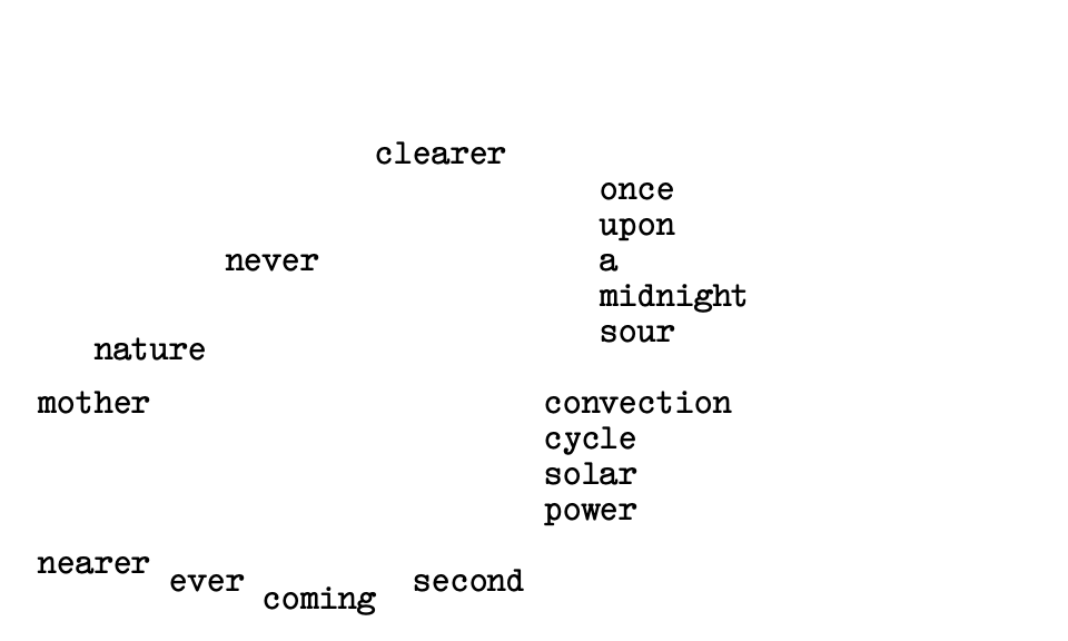
This is a little experiment to simulate creating notecards with a typewriter. The card moves around as you type instead of the cursor, and you can’t undo mistakes—characters are typed over each other. I wanted to recreate the fun and frustration I had while making recipe cards on an old typewriter I got a while back. I spent a while trying to get the look of the typing indicator bar right, and I like how it turned out.

Cassette

cassette-lang.com

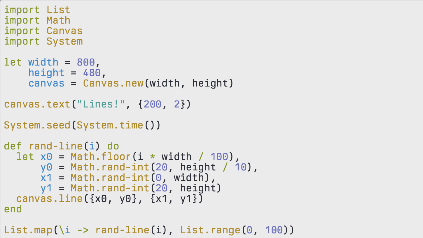
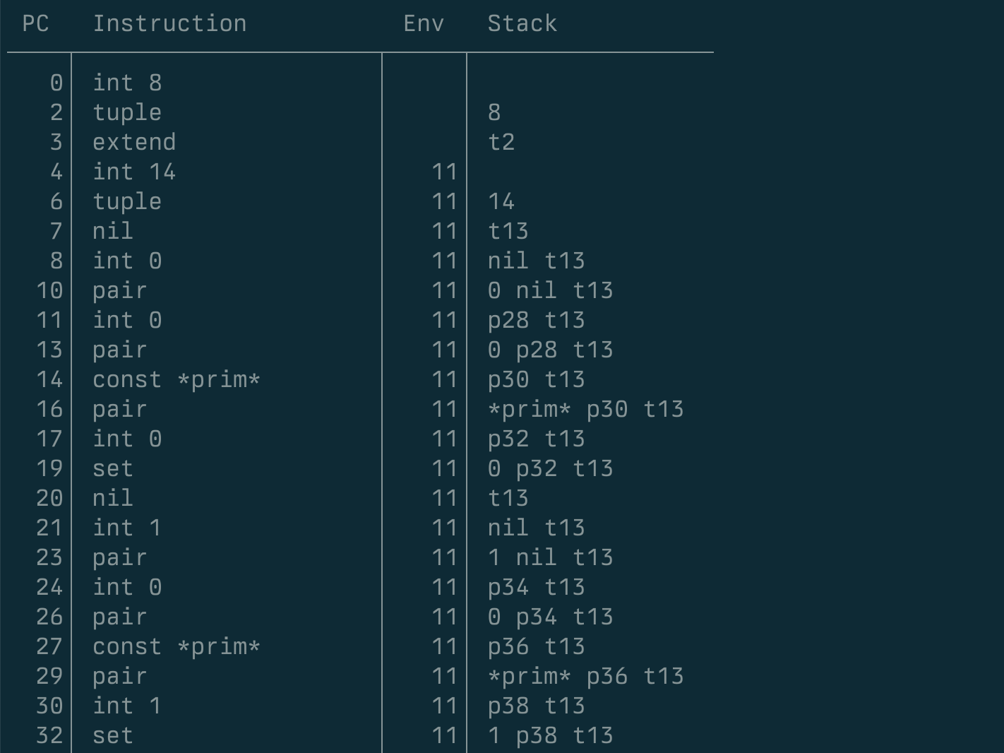
Over the course of 2023, I made a simple programming language from scratch in C, called Cassette. I wanted something simple and focused that I could use for small programming experiments and art projects. I designed the syntax and implemented a parser, compiler, and virtual machine for it. The syntax is inspired by Elixir, but evolved over the project. The most useful part of the project was the dynamic memory system, which implements the basic types and operations. I used this in the parser and compiler for intermediate data structures until late in the project, and the dynamic typing greatly sped up experimentation for those.

I wrote Cassette in C, mostly for performance and because I wanted the option to port it to an old Macintosh SE/30 I have. Writing in C as a solo dev on a side project has been a lot of fun, and very instructive, but I think I prefer higher level languages like Elixir for professional work.

There’s still plenty of future work and bugs to fix, but I’m pretty happy with the result, and I’m looking forward to using it and improving it in the future. For now, though, I want to turn back to Elixir and the Web.

Badgemaker

badgemaker.zjm.me

At Zillow, employees can earn badges on their profile for various accomplishments. Many of the badges look really nice, because they were created by our excellent design team. However, badges are pretty low priority, so often they don’t have time to create new ones, and many badges are designed by others without quite the same polish.

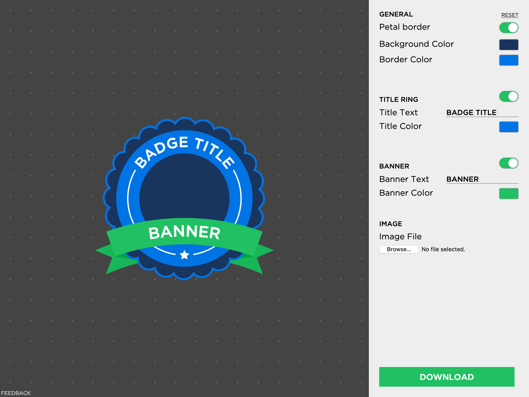
The inconsistency started to annoy me, so I decided to make this tool that would help anyone create a decent-looking (or at least consistent-looking) badge. Most of the badges follow a pretty standard template, so I distilled the controls down to only what varied between them.

The color picker users Vibrant.js to select a palette based on the image you upload, to make it even easier to match colors. The settings control an SVG image, which is downloaded as a PNG when the user is finished. They can then submit it to an admin to add to the system.

Brutal Chat

brutal.chat

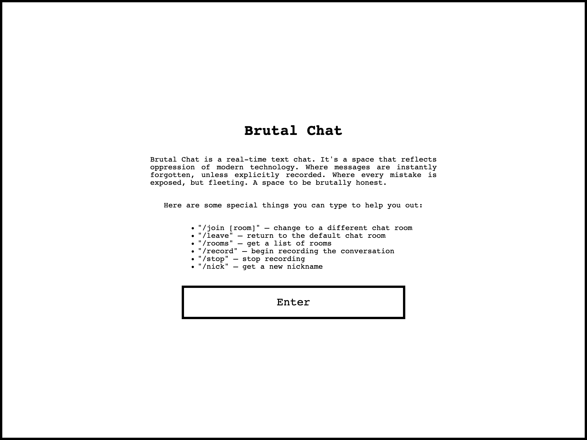
Brutalist web design has always been a favorite of mine. I love the clean lines, the lo-fi vibe, and the dark alternative proto-Internet that we all like to imagine used to exist. In some sense, it’s liberating to demand that the user bend to the idiosyncrasies of the design rather than cater to what users want or expect.

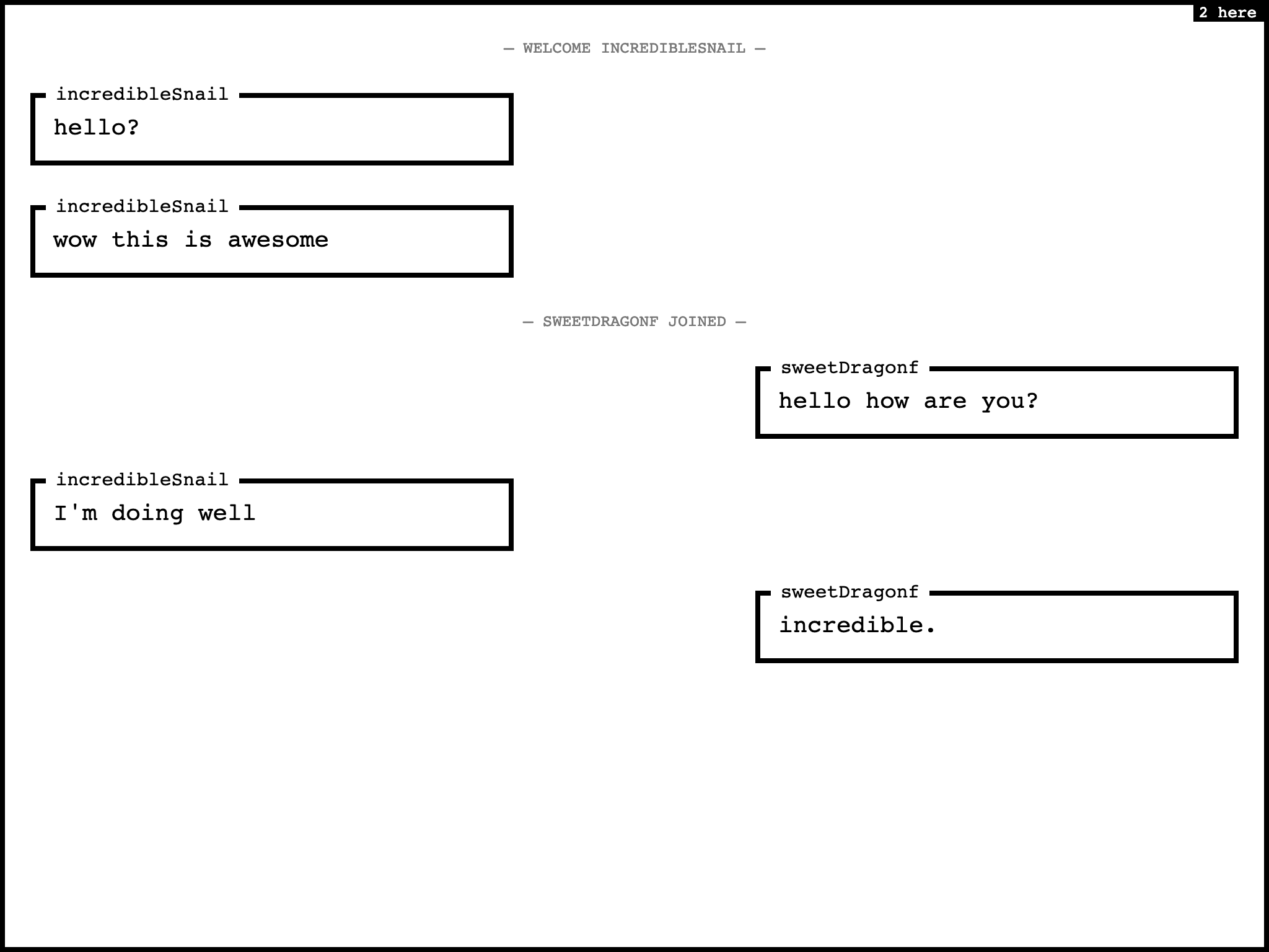
This specific project was greatly inspired by the chat mini-game thing in Super Hot. Basically, I stole the whole premise and turned it into a website. I loved the idea of real-time text, where you could see people make typos, and wouldn’t have to wait staring at a “John is typing…” status. The automatic pseudonyms were also a fun trick, which I imagined would give some illusion of privacy, when in reality you can learn to distinguish people pretty quickly based on their typing speed and accuracy.

The server is written with Express, a popular Node.js framework. It’s pretty simple — basically just rendering a React app and setting up Socket.io to relay messages. The socket file supports a few commands, as well as basic messaging, and is also relatively simple; in fact, I think a chat application is one of Socket.io’s example apps in their documentation. I use Redis to keep track of the number of users online in each room, and to record conversations (when that’s enabled). The client side is a pretty simple React app, with Redux to store the messages. As with most side projects, the code could be factored out a little better, but given the size of the project the organization doesn’t seem too hard to navigate.

Showing the app to some friends, we all got a kick out of playing around with it for a while, but understandably it never replaced our normal messaging platforms. Occasionally a few people will pop in from time to time, but it’s not as interesting if you’re the only one online. It was also included on brutalistwebsites.com, which is about all I was looking for anyway.